Why retailers are ditching neutrals and what it takes to execute colour at scale
Retail stores are getting louder.
And no — we’re not talking about the thumping bass or the dBs pouring out of your local fashion retailer.
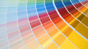
Across fashion, grocery, QSR, and specialty retail, designers are increasingly moving away from safe neutrals and embracing bold colour as the primary branding device inside physical stores.
Instead of using colour as a subtle accent, many new retail environments now rely on immersive palettes — from wall to wall — to define the entire space.
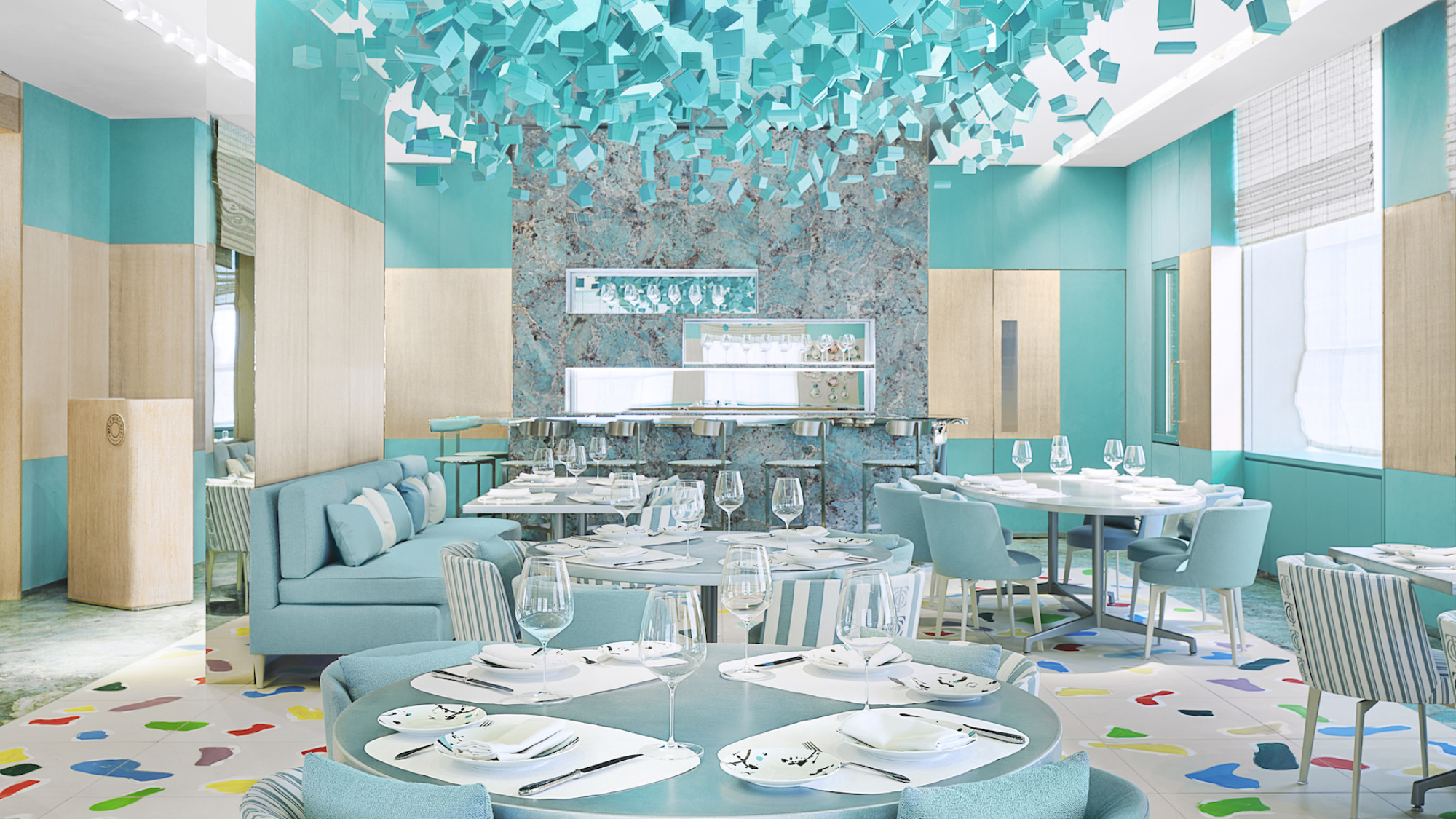
Recent projects like Target’s SoHo flagship in New York showcase the shift clearly. The redesign leans into saturated colour, layered finishes, and strong visual contrast to create an environment that is unmistakable from the moment customers step inside.
It’s a dramatic departure from the neutral-toned retail interiors that dominated the last decade.
But the rise of bold colour isn’t simply about aesthetics.
It’s about attention, identity, and shareability in an increasingly social-first retail world.
1. What’s driving the rise of bold colour in retail design?

Retailers are rediscovering colour as one of the most powerful tools in physical brand experience.
For years, store design leaned toward modern-corporate interiors — soft greys, pale woods, and white walls meant to keep attention focused on the merchandise. But in today’s retail landscape, that restraint can make a store fade into the background.
Bold colour changes that.
Strong palettes help stores:
- Stand out in crowded retail districts
- Reinforce brand identity instantly
- Create memorable environments that shoppers associate with the brand
In other words, colour is becoming part of the brand system, not just interior decoration.
When executed well, a bold palette can make a store recognizable long before a shopper ever reads a sign or logo.
2. How brands are using immersive palettes to create social-first retail spaces
This shift is years in the making.
As far back as 2019, we wrote about how social media was beginning to influence retail design.
(You can read those earlier insights in Retail Stores Are Content Creation Hubs Waiting to Happen and Top 6 Tips on How to Make Your Store TikTok Ready.)
Of course, retailers increasingly understand that physical stores are no longer just places to buy products — they’re also content environments.
Spaces designed with strong colour palettes, layered textures, and visually striking moments are far more likely to appear in:
- Instagram photos
- TikTok videos
- User-generated content shared by customers
In that sense, colour becomes part of the store’s marketing strategy, not just its interior design.
The goal isn’t simply to create a functional retail environment. It’s to create an experience people want to photograph, share, and revisit.
In a social-first retail world, the store becomes both a retail space and a media backdrop.
3. The hidden complexity of executing colour in real retail environments
While embracing bold colour takes vision and creative confidence, translating those palettes into real stores takes precision and discipline.
Because designers and fabrication teams must account for several real-world challenges.
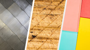
Material variation
Each material (metal, laminate, millwork, manufactured stone, acrylic, or glass) absorbs, refracts, and reflects colour differently. Achieving consistent tones across multiple surfaces requires careful material selection, specification, and fabrication.
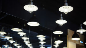
Lighting and perception
Retail lighting can dramatically change how colours appear in-store. A palette that looks vibrant in daylight may appear muted or overly saturated under LED lighting once the space is built.
Batch-to-batch consistency
When multiple components are fabricated separately, small variations between production batches can become visible once everything is installed together.
Now add a multi-location rollout spread across months or even years, and maintaining colour consistency becomes even more critical.
Because at scale, “close enough” is rarely good enough.
That’s why mockups and finish samples are often tested under real retail lighting conditions before fabrication begins, to ensure colour concepts can be manufactured, installed, and consistently repeated across multiple locations.
 The Bottom Line: Bold colour requires disciplined execution
Bold colour may be one of the most visible trends in modern retail design.
But behind every vibrant store environment is a carefully coordinated process that balances design intent, material selection, fabrication, and installation.
When executed well, colour can transform a retail space into something unmistakable.
But achieving that consistency — especially across multiple locations — requires the right combination of design vision and build expertise.
If you’re planning a new store concept, renovation, or multi-location rollout, working with an experienced design-build partner can help translate colour concepts into durable, buildable retail environments.
Contact Canada’s Best Store Fixtures to discuss your next retail project or request a quote.
Video Transcription
This is Target’s SoHo flagship.
Some critics think this over-the-top redesign is a big risk.
But is it?
Opened last December in New York, it’s part of a broader shift in brick-and-mortar retail — ditch those safe neutrals in favour of something louder.
Bold colour. From wall to wall.
You see it here. And here. And here.
These palettes aren’t accents; they’re defining the space.
Its colour, fully embraced, without hesitation, as the primary branding device.
And in a social-first retail world, impact matters.
But translating bold colour into a retail environment is no simple task.
You’re fighting batch-to-batch colour variations
Lighting that shifts how hues read in-store
And complex material sourcing or finishes
And when you’re rolling out at scale, “close enough” isn’t enough.
That’s why our Toronto-based millwork and metal shops collaborate directly with designers to translate colour stories into a buildable environment.
This is just one of the 2026 retail trends reshaping brick-and-mortar.
See the full breakdown and more insights at canadasbeststorefixtures.com
Canada’s Best Store Fixtures. We bring retail strategies to life.
***
Research and initial drafting for this article were supported by AI tools, including Perplexity and ChatGPT. All sources were independently verified, and the final content was reviewed and edited by our team.